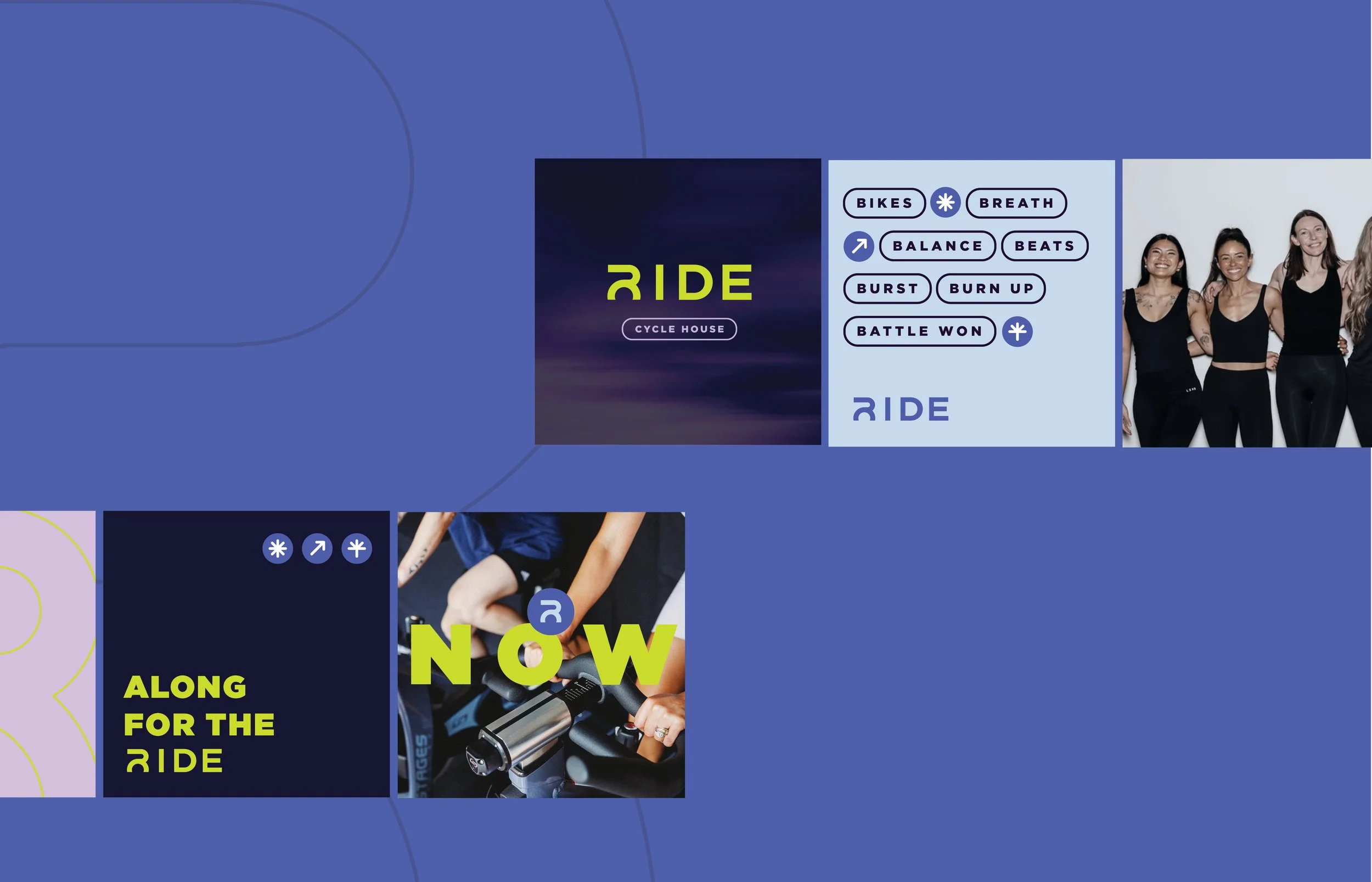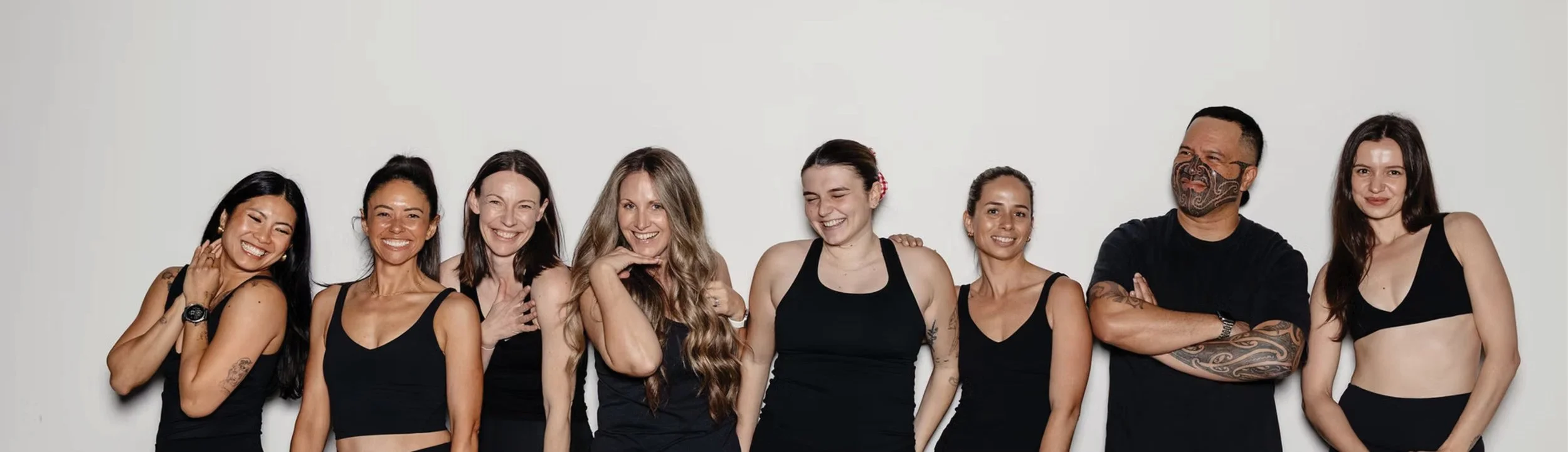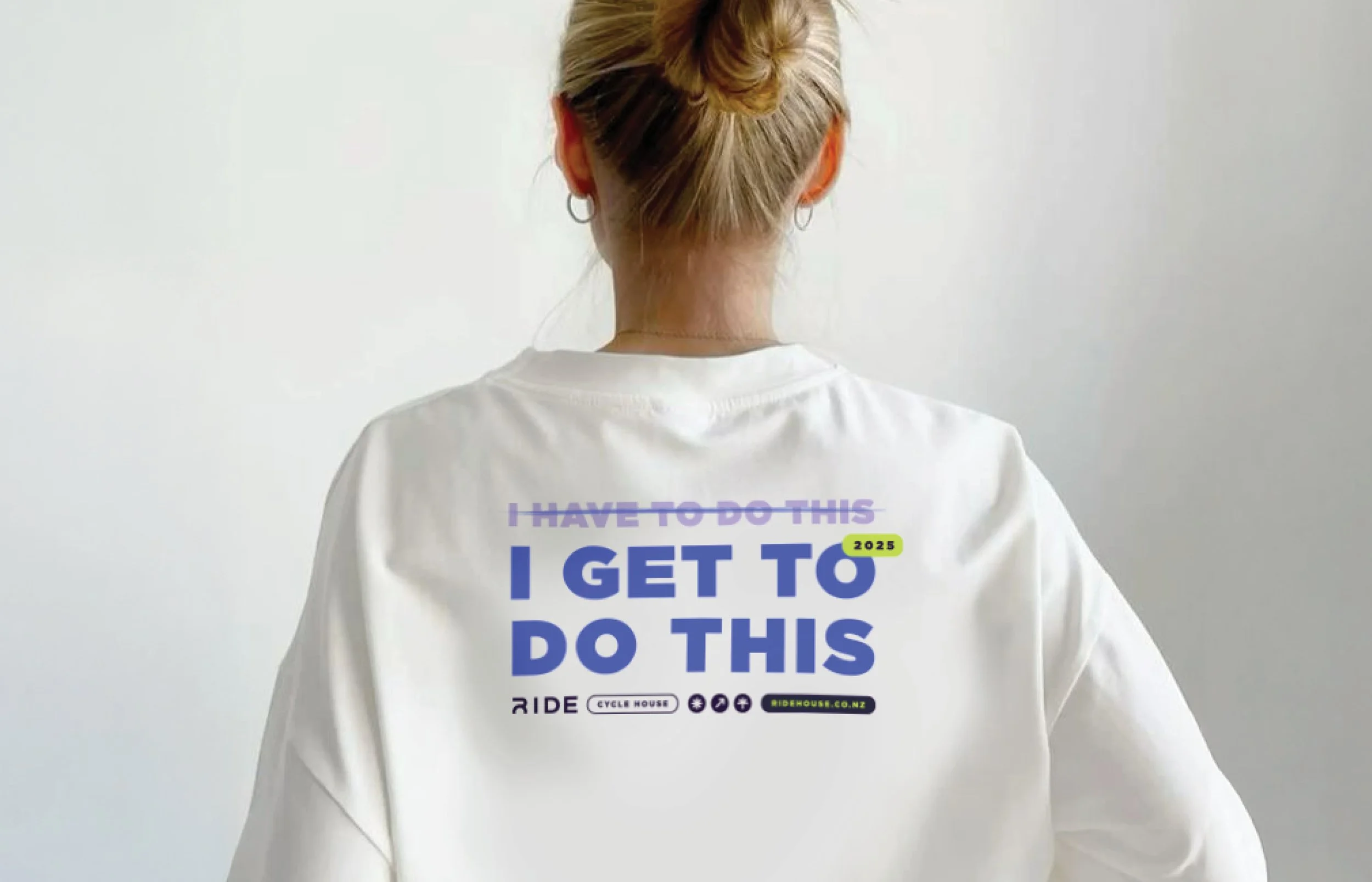
RIDE began with a vision: strip away intimidation and celebrate the joy of movement. While their doors are open to all, their spin cycle method is precision-crafted. The beat drops, the lights dim, and suddenly you’re part of an electric workout that is also a whole heeeap of fun.
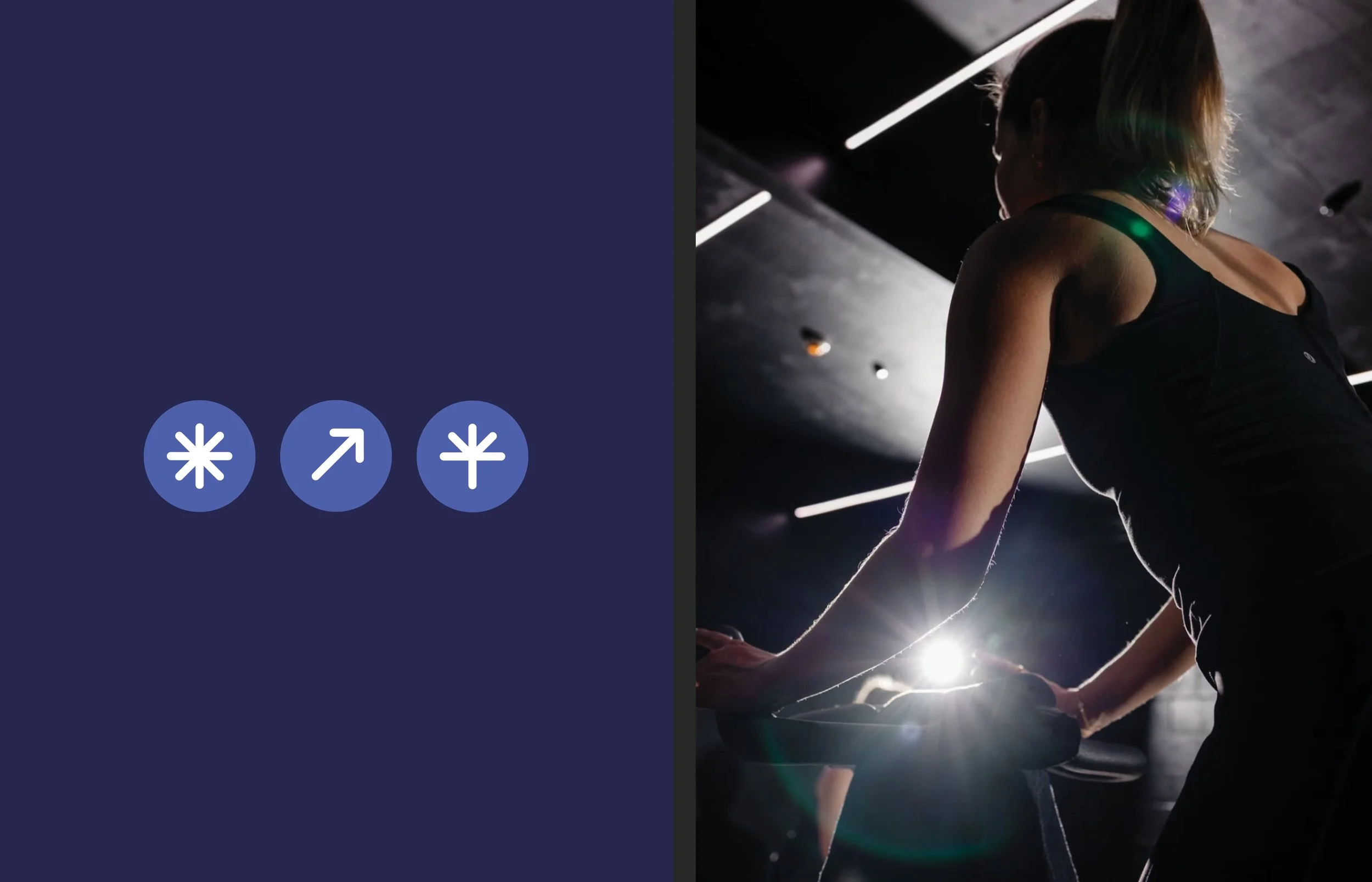
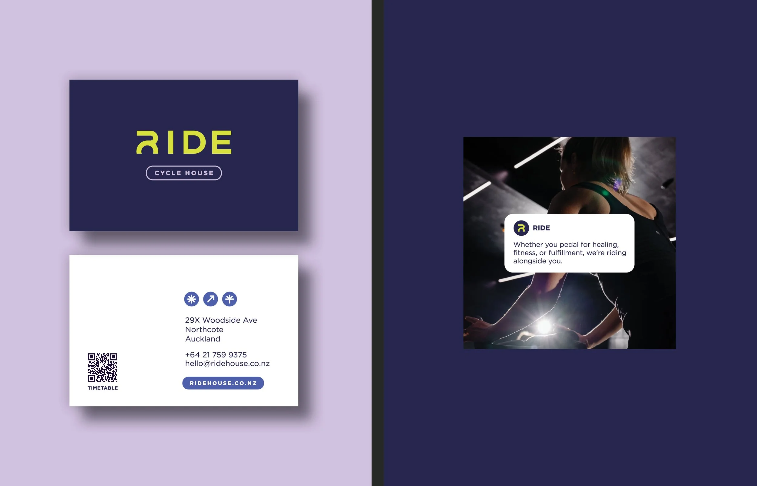
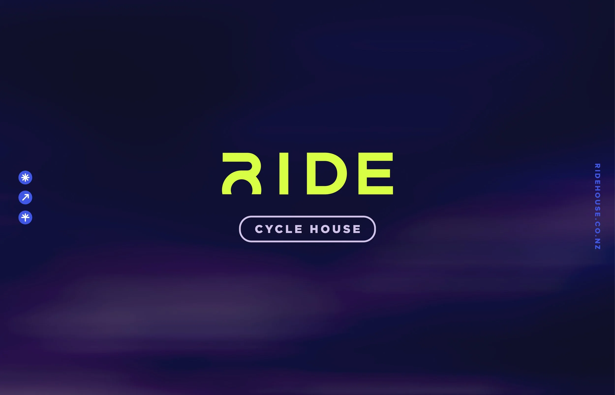
Looking into the logo, RIDE’s custom-crafted R has been inspired by the front of a bike – the top of the letter represents the handle bars, the bottom half represents the top of the front wheel. A gender-neutral visual language balances trusted expertise with bold, fun, energetic expression, and includes fun sticker-style icons that represent the studio’s principles – ‘push’, ‘build’ and ‘community’.
branding
social assets